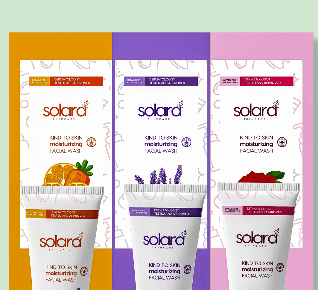
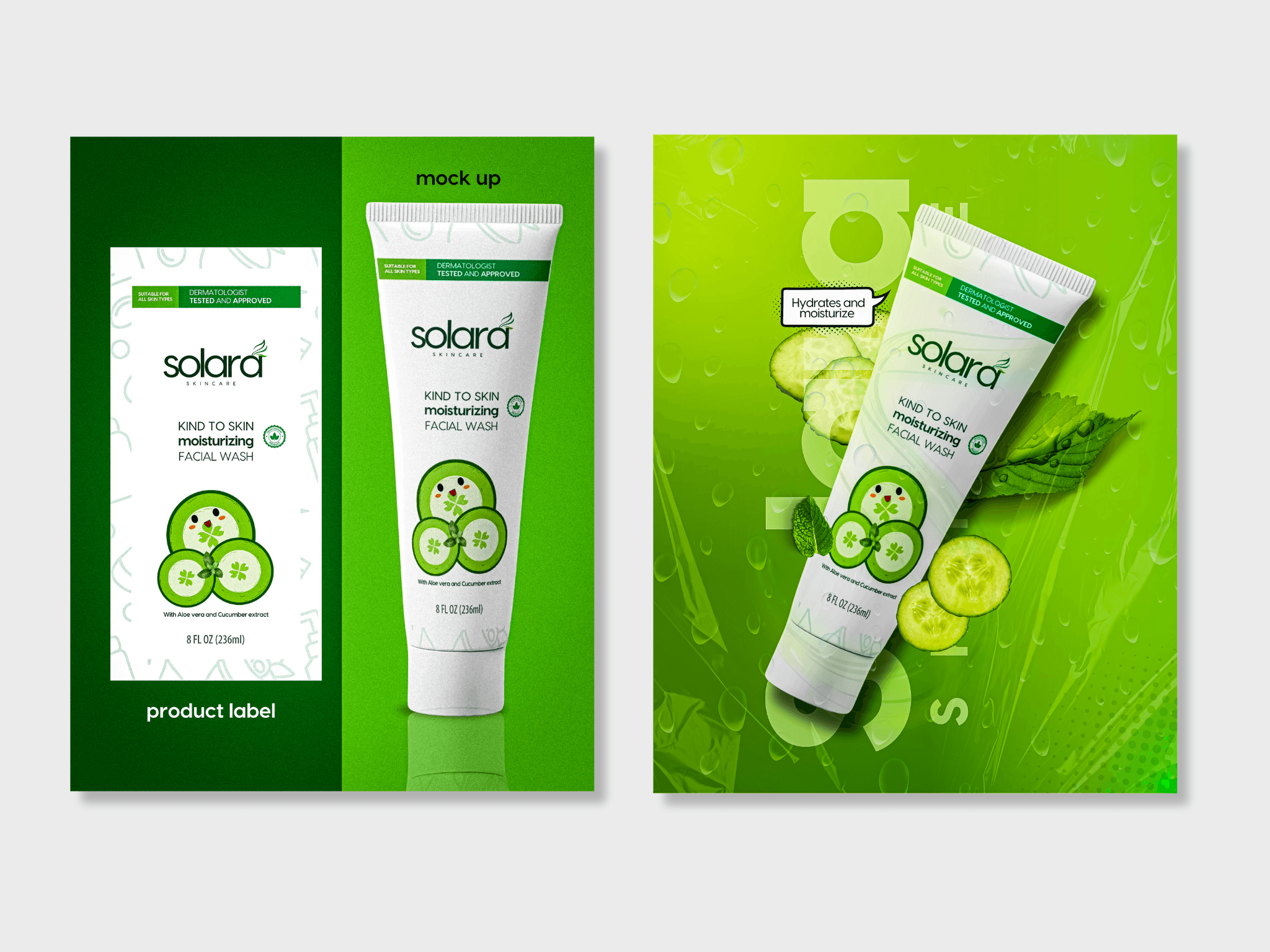
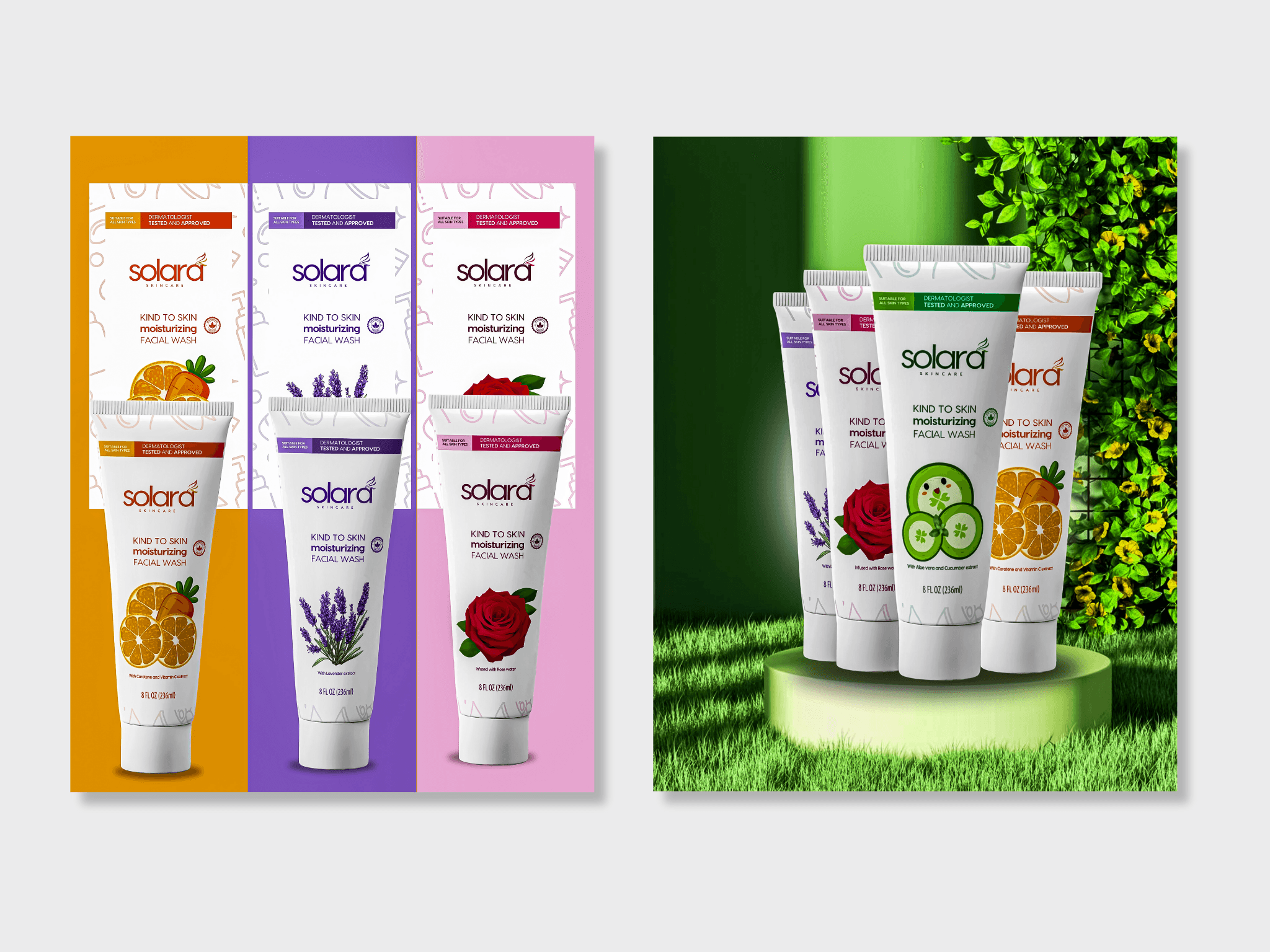
Typography was kept simple and elegant to maintain a clean aesthetic. I avoided clutter and excessive text, focusing on essential product information and clear hierarchy. Every design element was carefully considered to evoke trust and appeal to a skincare savvy audience that appreciates beauty in restraint.
I chose a soft, airy layout with generous white space to communicate purity and calm. The color palette was built around muted, pastel tones that align with each product variant: green for Aloe Vera, coral-orange for Orange Extract, blush pink for Rosewater, and lavender for, of course, Lavender. These tones were selected not only to differentiate each product visually, but also to create a soothing, cohesive feel when displayed as a collection